- Marketing
- UI/UX design
- Branding
- Web-design


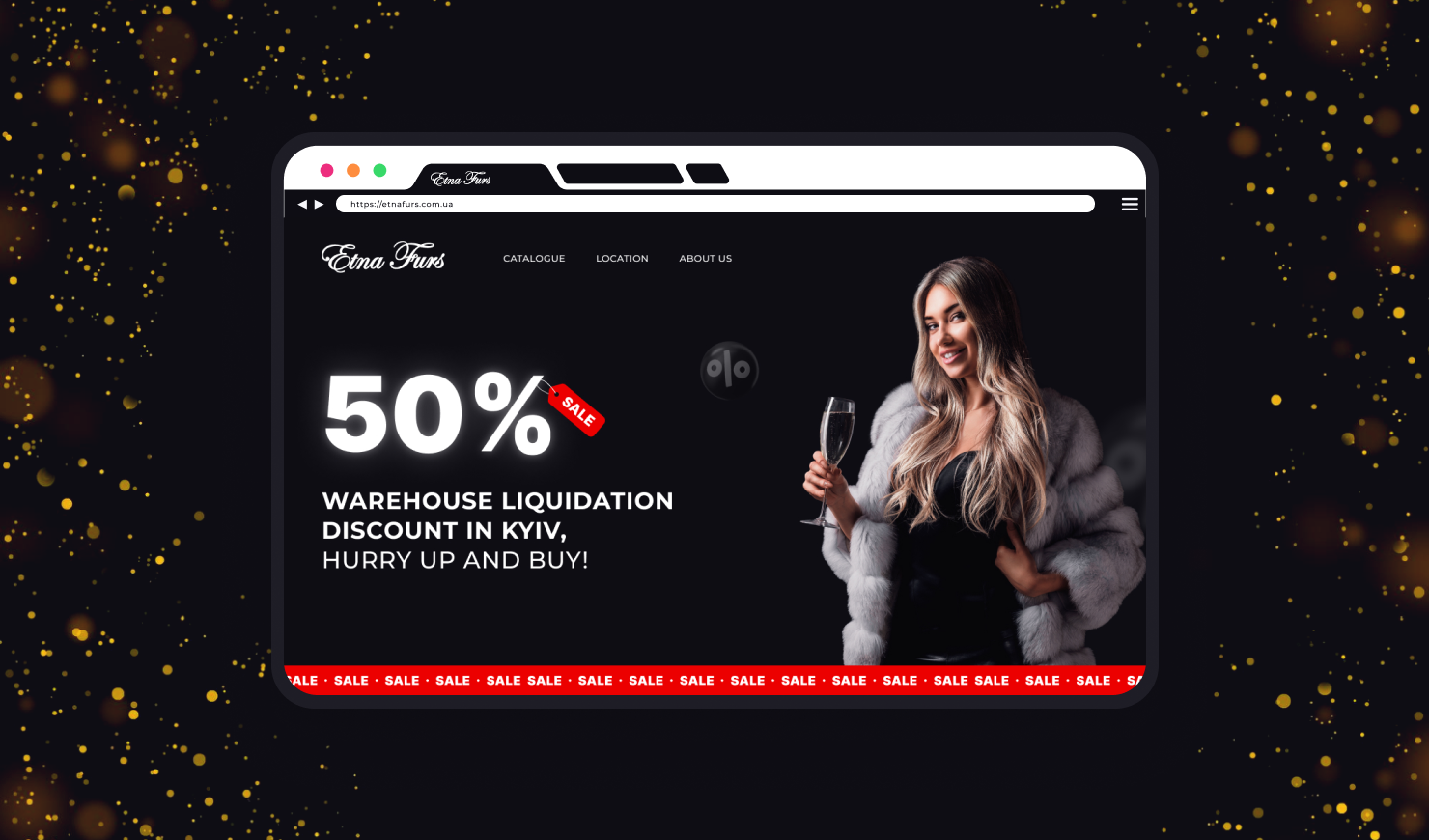
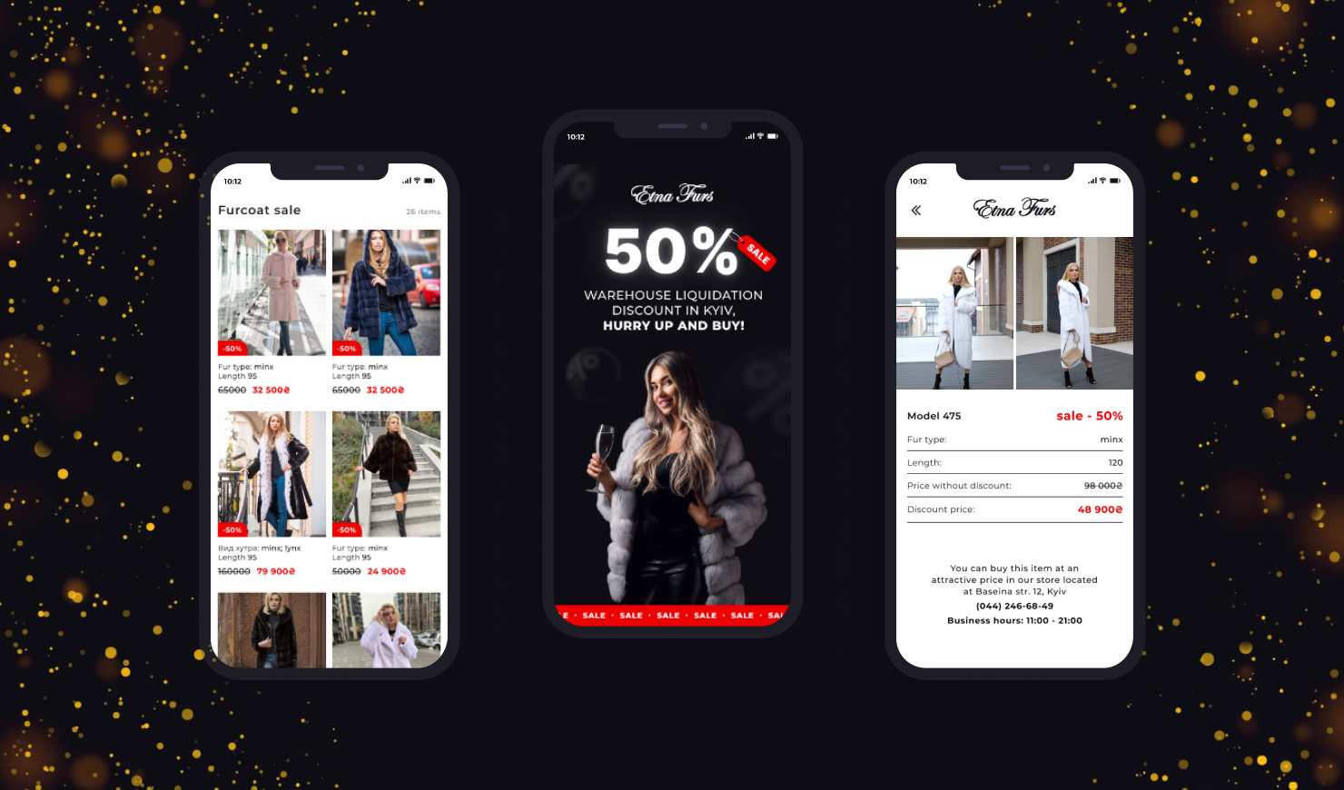
The main page greets us with a powerful offer: a 50% discount on fur coats due to warehouse liquidation. This is how we get the users' attention and explain the reason for the sale.

This is followed immediately by the product catalog. Each detail is designed in such a way as to emphasize the benefit of the purchase. That's why the photos are complemented with a bright "-50%" sticker, and there's an opening and closing price at the bottom. Customers don't have to wander around the website and open multiple pages to learn more about the products because the essential information (type of fur and product measurements) is already displayed on the main page.

Additional blocks include information for search engines. Our specialists performed primary SEO optimization and set up ads. Thanks to this, the site attracts users and is actively promoted online. Finally, we displayed information on the offline store locations and working hours and added photos so customers can easily find the stores in the malls of Kyiv and Dnipro.
