- Branding
- Marketing
- UI/UX design
- Web-design


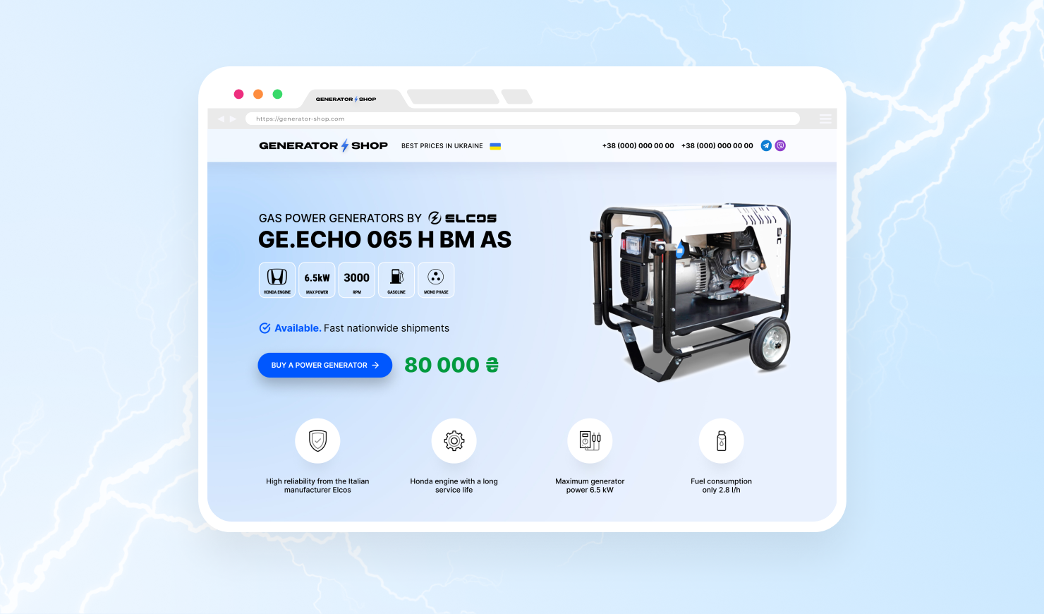
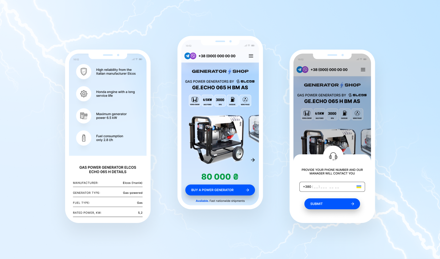
As soon as they open the website, customers can immediately see the main characteristics of the power generators. To avoid overloading the main page with too much information, we displayed the essential data in the form of icons, while the product itself is displayed on the right. Below, you can see the main advantage of the Generator Shop: the product is in stock and you don’t have to wait for it, which means you can buy it right now. If a customer is ready to make an order, they can click on the appropriate button and submit a request for a callback. The company manager’s contact information is also displayed there.

To emphasize the quality and reliability of the equipment, we added a section that includes comprehensive information on manufacturers, as well as an embedded video showing the manufacturing process of the company's products. Next to it is a button that opens a feedback form.

We’ve developed a mobile version of the website to make it easier to access both on a desktop and a mobile device. Thanks to the primary SEO optimization, we’ve increased the website’s search engine visibility, which means that even more of the target audience will come to the store.
